Sep
24
Written by:
Michael Washington
9/24/2011 10:35 PM


In this Blog post, we will create a LightSwitch Control Extension that consists of a Button. The LightSwitch Control Extension will allow us to specify the color of each instance of the Button.
At this time, there is no other documentation anywhere describing how to create a LightSwitch Control Extension that is of type Command (used for Buttons). John Stallo, and Stephen Weatherford of Microsoft assisted in this Blog. Ok, they did more than that, I was totally stuck until they provided the code that actually makes the Button work  . Microsoft does plan to make official documentation about this in the future.
LightSwitch Custom Controls vs. LightSwitch Control Extensions
If you are not a Silverlight programmer, LightSwitch is still easy to use. You just need to use LightSwitch Control Extensions. It is important to note the difference between a Silverlight Custom Control, and a LightSwitch Control Extension.
Essentially the difference is that a LightSwitch Control Extension is installed into LightSwitch, and meant to be re-used in multiple LightSwitch applications, like a normal internal LightSwitch control. The downside is, that creating a LightSwitch Control Extension, is significantly more difficult and time-consuming.
Silverlight Custom Controls are controls created specifically for the LightSwitch application they will be implemented in. They are significantly easier to create.

Control Extensions are harder to create, but they are significantly easer to use. Keep in mind that for full control over the look of the user interface, you will want to use a Silverlight Custom Control because one disadvantage of Control Extensions, is that you can only change options that are available in the property options panel for the control (see: The LightSwitch Control Extension Makers Dilemma).

There are 5 types of Control Extensions you can create. This article will only demonstrate the Command Control Extension.
How to: Create a LightSwitch Control Extension
This page: http://msdn.microsoft.com/en-us/library/gg674919.aspx will provide an overview of the LightSwitch Control Extension process. Basically, you use the Visual Studio LightSwitch 2011 Extensibility Toolkit, that is available here: http://visualstudiogallery.msdn.microsoft.com/0dfaa2eb-3951-49e7-ade7-b9343761e1d2.
You will need to install:
-
Visual Studio 2010 SP1 (Professional, Premium, or Ultimate edition)
-
Visual Studio 2010 SP1 SDK
-
Visual Studio LightSwitch 2011
-
Visual Studio LightSwitch 2011 Extensibility Toolkit
Create The LightSwitch Control Extension

Open Visual Studio and select File, then New Project.
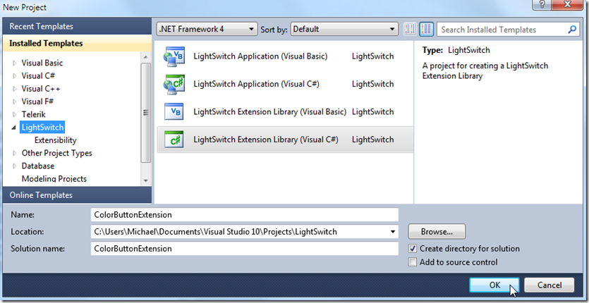
Name the project ColorButtonExtension.
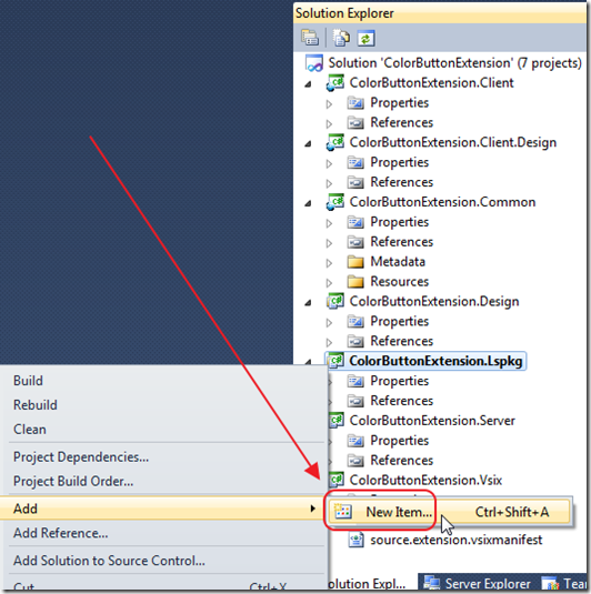
A number of Projects will be created.
Right-click on the ColorButtonExtension.Lspkg project and select Add then New Item.
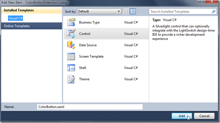
Select Control, and name it ColorButton.xaml.
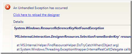
If you get the Unhandled Exception error …
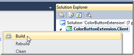
Build the ColorButtonExtension.Client project.
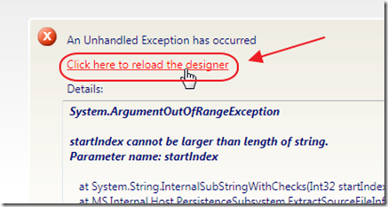
Then click the reload designer link.
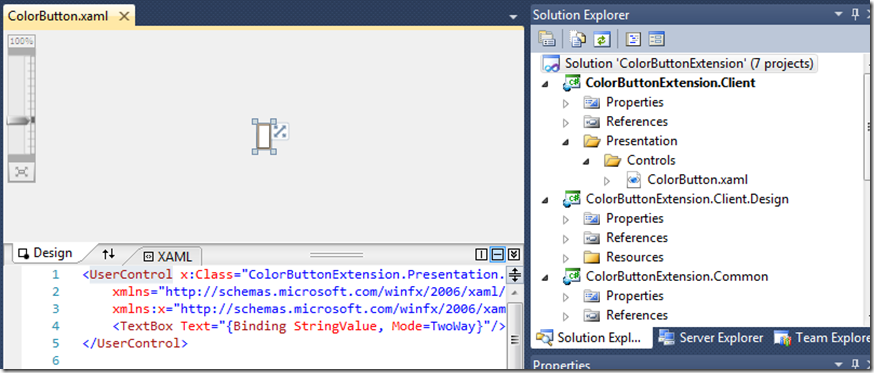
The screen will resemble the image above.
Create A Basic Button
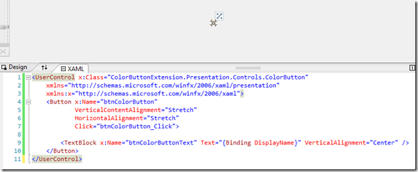
Change all the text in the ColorButton.xaml file to the following:
<UserControl x:Class="ColorButtonExtension.Presentation.Controls.ColorButton"
    xmlns="http://schemas.microsoft.com/winfx/2006/xaml/presentation"
    xmlns:x="http://schemas.microsoft.com/winfx/2006/xaml">
    <Button x:Name="btnColorButton"
            VerticalContentAlignment="Stretch"
            HorizontalAlignment="Stretch"
            Click="btnColorButton_Click">
        <TextBlock x:Name="btnColorButtonText" Text="{Binding DisplayName}" VerticalAlignment="Center" />
    </Button>
</UserControl>
Note that {Binding DisplayName} will display whatever is entered in the Display Name box in the Button’s Properties when the Button is placed on a Screen in LightSwitch.
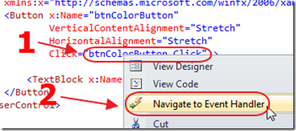
Then, right-click on the Button markup and select Navigate to Event Handler.
Use the following code for the method:
        private void btnColorButton_Click(object sender, RoutedEventArgs e)
        {
            // Get the DataContext
            IContentItem contentItem = (IContentItem)this.DataContext;
            // This is a Command so cast it to IExecutable
            Microsoft.LightSwitch.IExecutable executable = (Microsoft.LightSwitch.IExecutable)contentItem.Details;
            // Check that the IExecutable is not null and can be executed
            if (executable != null && executable.CanExecuteAsync)
            {
                // Invoke the IExecutable
                executable.ExecuteAsync();
            }
        }
Basically, The IContentItem is the DataContext for a LightSwitch control. The .lsml file will indicate that only a Command can be bound to this control. That means that the item bound to this control will be of type IExecutable. We will therefore cast it to IExecutable, and call ExecuteAsync() to simply raise the Command.
Edit The .lsml File
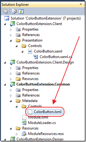
The .lsml file is a manifest file that contains information that is merged into the LightSwitch .lsml file when the LightSwitch Control Extension is installed and enabled into a LightSwitch application.
Open the ColorButton.lsml file, and replace all the contents with the following:
<?xml version="1.0" encoding="utf-8" ?>
<ModelFragment
  xmlns="http://schemas.microsoft.com/LightSwitch/2010/xaml/model"
  xmlns:x="http://schemas.microsoft.com/winfx/2006/xaml">
    <!-- SupportedContentItemKind determines -->
    <!-- the type of LightSwitch Control Extension -->
    <!-- Value, Details, Command, Collection, Group -->
    <Control Name="ColorButton"
      SupportedContentItemKind="Command"
      DesignerImageResource="ColorButtonExtension.ColorButton::ControlImage">
        <Control.Attributes>
            <DisplayName Value="Color Button" />
        </Control.Attributes>
    </Control>
</ModelFragment>
Prepare The LightSwitch Control Extension Package
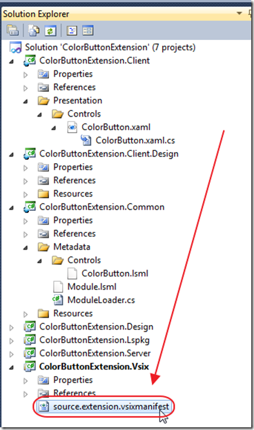
In the Solution Explorer, double-click on the source.extension.vsixmanifest file to open it.
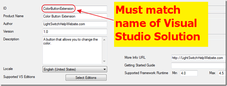
This page allows you to set properties for the control. For more information see: How to: Set VSIX Package Properties and How to: Distribute a LightSwitch Extension.
Test The LightSwitch Control Extension
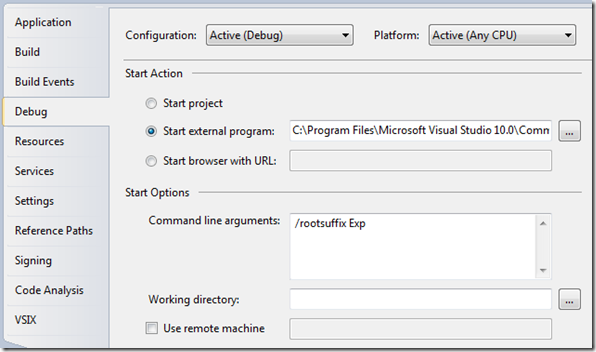
Note: All these values may already be set correctly:
-
In the Solution Explorer, select the ColorButtonExtension.Vsix project.
-
On the menu bar, choose Project, ColorButtonExtension.Vsix Properties.
-
On the Debug tab, under Start Action, choose Start external program.
-
Enter the path of the Visual Studio executable, devenv.exe.
By default on a 32-bit system, the path is C:\Program Files\Microsoft Visual Studio 10.0\Common7\IDE\devenv.exe; on a 64-bit system, it is C:\Program Files (x86)\Microsoft Visual Studio 10.0\Common7\IDE\devenv.exe.
-
In the Command line arguments field, type /rootsuffix Exp as the command-line argument.
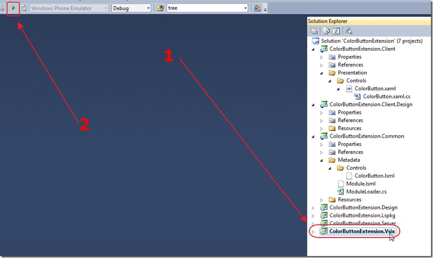
Ensure that the ColorButtonExtension.Vsix project is selected in the Solution Explorer, then Start Debugging.

This will open another instance of Visual Studio.
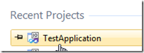
Create or open a test application (do not use one of your normal LightSwitch applications for testing because they can become corrupted).
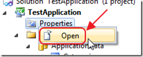
In the Solution Explorer, right-click on Properties and select Open, to open them.

Select the Extensions tab, and check the box next to Color Button Extension.
We can now select the Color Button in any situation that a normal button can be used, except:
- A Button for a DataGrid (it uses it’s own special buttons. You will want to use a Silverlight Custom Control for a DataGrid if you need to change the buttons). However, you can use the Button on a DataGrid row.
- A Shell Button (on the standard Shell these are the buttons at the top of the screen. You are able to change the image on those buttons without the need for a LightSwitch Control Extension)
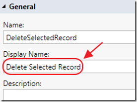
The text entered in the Display Name Property for the Button…
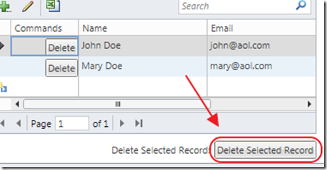
Will display as the text for the Button.
Setting Parameters For A LightSwitch Control Extension
We desire to allow the LightSwitch application designer, the ability to specify the color of each instance of the Button.
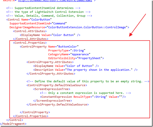
Add the following section to the ColorButton.lsml file:
        <Control.Properties>
            <ControlProperty Name="ButtonColor"
                             PropertyType=":String"
                             CategoryName="Appearance"
                             EditorVisibility="PropertySheet">
                <ControlProperty.Attributes>
                    <DisplayName Value="Color of Button" />
                    <Description Value="The property shown in the application." />
                </ControlProperty.Attributes>
                <!-- Define the default value of this property to be an empty string. -->
                <ControlProperty.DefaultValueSource>
                    <ScreenExpressionTree>
                        <!-- Only a constant expression is supported here. -->
                        <ConstantExpression ResultType=":String" Value=""/>
                    </ScreenExpressionTree>
                </ControlProperty.DefaultValueSource>
            </ControlProperty>
        </Control.Properties>
This creates a ButtonColor property that can be set in the LightSwitch property panel for each instance of the Button.
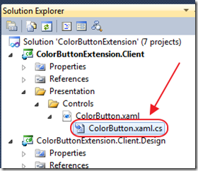
Open the ColorButton.xaml.cs file.
Add the following method that will return a color when passed the name of the color:
        private static Color GetColor(string strButtonColor)
        {
            var objColor = Colors.Black;
            switch (strButtonColor)
            {
                case "Black":
                    objColor = Colors.Black;
                    break;
                case "Blue":
                    objColor = Colors.Blue;
                    break;
                case "Red":
                    objColor = Colors.Red;
                    break;
                default:
                    break;
            }
            return objColor;
        }
Add the following methods and properties that will set the color of the Button text:
        public string ButtonColor
        {
            get { return (string)GetValue(ButtonColorProperty); }
            set { SetValue(ButtonColorProperty, value); }
        }
        public static readonly DependencyProperty ButtonColorProperty =
            DependencyProperty.Register("ButtonColorProperty", typeof(string),
            typeof(ColorButton), new PropertyMetadata(OnButtonColorPropertyChanged));
        private static void OnButtonColorPropertyChanged(DependencyObject d, DependencyPropertyChangedEventArgs e)
        {
            // When the ContentItem is changed, reset the internal data binding.
            ColorButton CB = (ColorButton)d;
            CB.btnColorButtonText.Foreground = new SolidColorBrush(GetColor(CB.ButtonColor));
        }
This creates a Dependency Property to store the color of the TextBlock that displays the text on the Button .
The OnButtonColorPropertyChanged method assigns the color to the TextBlock .
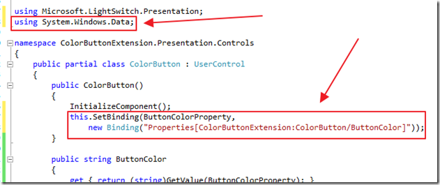
Next, add the using statement:
using System.Windows.Data;
Also, add the following code to the constructor under InitializeComponent();
            this.SetBinding(ButtonColorProperty,
                new Binding("Properties[ColorButtonExtension:ColorButton/ButtonColor]"));
This binds the Dependency Property to the ButtonColor property that was just added to the .lsml file.
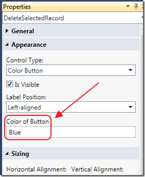
When we debug the Button, we see that there is now a Color of Button box, and it allows us to enter a color (Black, Red, or Blue).
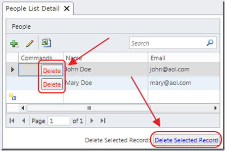
The Button will display the color entered for that instance of the Button.
Making A LightSwitch Control Extension Editor (WPF)
Requiring the LightSwitch application designer to properly type in the color is not the best user experience, because the LightSwitch application designer could easily make a mistake and enter an invalid entry and the program will crash.
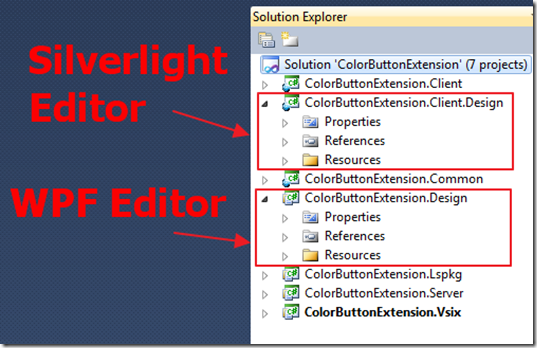
We now desire to add a dropdown that will contain the color choices. To do this, we will need to create a WPF Editor in the ColorButtonExtension.Design project. This will allow us to create a dropdown control that will be shown to allow the color to be set.
Also note, that when LightSwitch is in debug mode, the LightSwitch application designer is able to edit controls using a Silverlight editor. To allow a LightSwitch application designer to see a dropdown there, you would need to make an Silverlight Editor in the ColorButtonExtension.Client.Design project. That will not be covered in this Blog, but you can see the article: Walkthrough: Creating a Detail Control Extension for an example.
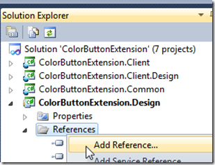
In Solution Explorer, right-click on the ColorButtonExtension.Design project, and choose Add Reference.

In the Add Reference dialog box, add a reference to Microsoft.LightSwitch.Design.Designer.dll.
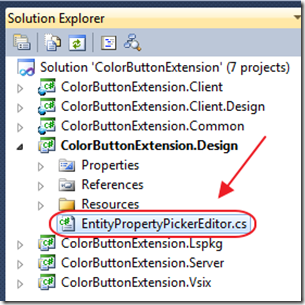
Add a class called EntityPropertyPickerEditor.cs to the ColorButtonExtension.Design project, and use the following code:
using System.ComponentModel.Composition;
using System.Windows;
using System.Windows.Markup;
using Microsoft.LightSwitch.Designers.PropertyPages;
using Microsoft.LightSwitch.Designers.PropertyPages.UI;
namespace ColorButtonExtension.Editors
{
    /// <summary>
    /// EntityPropertyPickerProvider is a component to allow LightSwitch designers in Visual Studio
    /// to create a property value editor.
    /// The name of the editor is specified in a PropertyValueEditorName attribute.
    /// When it is needed, a designer will use the
    /// EditorTemplate to create a WPF control, which can be hosted inside a property sheet window.
    /// The DataContext of this control will be an IBindablePropertyEntry object.
    /// Through the DataContext, the control can update the property value.
    /// </summary>
    [Export(typeof(IPropertyValueEditorProvider))]
    [PropertyValueEditorName("ColorButtonExtension:EntityPropertyPicker")]
    [PropertyValueEditorType("System.String")]
    public class EntityPropertyPickerProvider
        : IPropertyValueEditorProvider
    {
        public IPropertyValueEditor GetEditor(IPropertyEntry entry)
        {
            return new Editor();
        }
        private class Editor : IPropertyValueEditor
        {
            public object Context
            {
                get
                {
                    // A design-time editor allows an additional Context object,
                    // which is exposed through IBindablePropertyEntry.EditorContext.
                    // This allows the editor to have additional status.
                    // However, the run-time designer does not support it.
                    // It is not used in this sample.
                    return null;
                }
            }
            // The DataTemplate is used by the screen designer to create the UI control on the property sheet.
            public DataTemplate GetEditorTemplate(IPropertyEntry entry)
            {
                return XamlReader.Parse(ControlTemplate) as DataTemplate;
            }
        }
        #region Constants
        private const string ControlTemplate =
            "<DataTemplate" +
            " xmlns=\"http://schemas.microsoft.com/winfx/2006/xaml/presentation\"" +
            " xmlns:x=\"http://schemas.microsoft.com/winfx/2006/xaml\"" +
            " xmlns:editors=\"clr-namespace:ColorButtonExtension.Editors;assembly=ColorButtonExtension.Design\">" +
            "   <editors:EntityPropertyPicker/>" +
            "</DataTemplate>";
        #endregion
    }
}
According to Walkthrough: Creating a Detail Control Extension:
“This code implements a component that can be loaded by a LightSwitch designer based on its name inside a PropertyValueEditorName attribute. When a LightSwitch designer displays a property marked to use an editor with the same name, it will create a WPF control with the DataTemplate and host it in the property sheet. The DataContext of the control will be set to an IBindablePropertyEntry object, where the control can get or set the value of the property.” – Microsoft Corporation
When you are creating your own LightSwitch Control Extension, you will want to replace ColorButtonExtension with the name of your own Visual Studio Solution name.
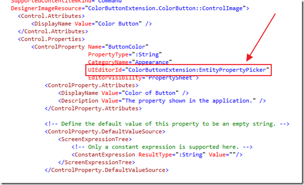
Now that we have established a PropertyValueEditorName, add this line to the .lsml file:
UIEditorId="ColorButtonExtension:EntityPropertyPicker"
Implement The Editor Control
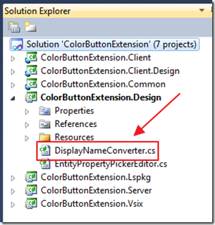
We will now implement the Editor control. However, we will need a value converter.
Create a new class file called DisplayNameConverter.cs in the ColorButtonExtension.Design project, and use the following code:
using System;
using System.Windows.Data;
namespace ColorButtonExtension.Editors
{
    /// <summary>
    /// DisplayNameConverter is a converter to append ':' to the property name.
    /// The result is used inside the label to edit the property.
    /// It is important not to append ':' directly inside the property name.
    /// </summary>
    public class DisplayNameConverter
        : IValueConverter
    {
        public object Convert(object value, Type targetType,
            object parameter, System.Globalization.CultureInfo culture)
        {
            if (value != null)
            {
                return String.Format(
                    System.Globalization.CultureInfo.CurrentCulture,
                    "{0}:", value);
            }
            return String.Empty;
        }
        public object ConvertBack(object value, Type targetType,
            object parameter, System.Globalization.CultureInfo culture)
        {
            throw new NotSupportedException();
        }
    }
}
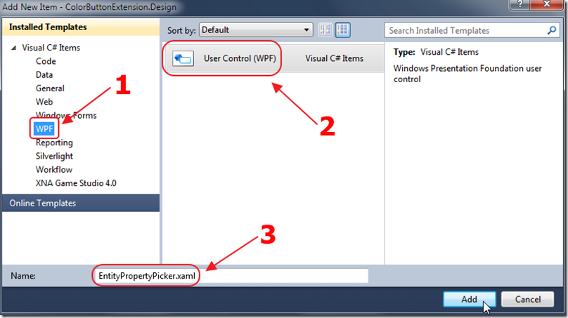
Add a new WPF User Control to the ColorButtonExtension.Design project, and call it EntityPropertyPicker.xaml.
Use the following code for the .xaml file:
<UserControl x:Class="ColorButtonExtension.Editors.EntityPropertyPicker"
             xmlns="http://schemas.microsoft.com/winfx/2006/xaml/presentation"
             xmlns:x="http://schemas.microsoft.com/winfx/2006/xaml"
             xmlns:mc="http://schemas.openxmlformats.org/markup-compatibility/2006"
             xmlns:d="http://schemas.microsoft.com/expression/blend/2008"
             xmlns:e="clr-namespace:ColorButtonExtension.Editors"
             mc:Ignorable="d"
             d:DesignHeight="300" d:DesignWidth="300">
    <UserControl.Resources>
        <e:DisplayNameConverter x:Key="DisplayNameConverter" />
    </UserControl.Resources>
    <!--
    DesignTimeFontSize and DesignTimeFontFamily are design-time public resource items.
    Use them to ensure that you use the same font inside different controls on the property sheet.
    -->
    <Grid TextBlock.FontSize="{DynamicResource DesignTimeFontSize}"
          TextBlock.FontFamily="{DynamicResource DesignTimeFontFamily}"
>
        <Grid.RowDefinitions>
            <RowDefinition Height="Auto" />
            <RowDefinition Height="Auto" />
        </Grid.RowDefinitions>
        <!--
            That is the label to show the property name.
            The DataContext of this control is an IBindablePropertyEntry object.
            Use its Entry property to get the IPropertyEntry.
        -->
        <TextBlock x:Name="ComboBoxLabel"
                   Text="{Binding Entry.DisplayName, Mode=OneWay,
                   Converter={StaticResource DisplayNameConverter}}"
                   TextWrapping="WrapWithOverflow"
                   ToolTip="{Binding Entry.Description, Mode=OneWay}"
                   Margin="0,0,0,2"/>
        <!--
            This is the ComboBox to pick up the value.  The DataContext of this
            control is an IBindablePropertyEntry object. Use its Entry property to get the IPropertyEntry.
            The PropertyValue.Value is the value of the DisplayProperty of the control.
        -->
        <ComboBox x:Name="cbComboBox"
                  Grid.Row ="1"
                  SelectedItem="{Binding Entry.PropertyValue.Value}"
                  AutomationProperties.LabeledBy="{Binding ElementName=EditorLabel}"
                  HorizontalAlignment="Stretch"
                  >
            <ComboBox.ItemTemplate>
                <DataTemplate>
                    <TextBlock Text="{Binding}" />
                </DataTemplate>
            </ComboBox.ItemTemplate>
        </ComboBox>
    </Grid>
</UserControl>
Use the following code for the .cs file:
using System.Windows;
using System.Windows.Controls;
using System.Windows.Data;
using Microsoft.LightSwitch.Designers.PropertyPages.ViewModel;
namespace ColorButtonExtension.Editors
{
    public partial class EntityPropertyPicker : UserControl
    {
        // This property is created because it allows us to raise
        // "OnExplorerControlDataContextPropertyChanged"
        // When the DataContext is updated
        public static readonly DependencyProperty ExplorerControlDataContextProperty =
            DependencyProperty.Register("DummyProperty", typeof(IBindablePropertyEntry),
            typeof(EntityPropertyPicker),
            new PropertyMetadata(OnExplorerControlDataContextPropertyChanged));
        public EntityPropertyPicker()
        {
            InitializeComponent();
            this.SetBinding(ExplorerControlDataContextProperty, new Binding());
        }
        private static void OnExplorerControlDataContextPropertyChanged(
            DependencyObject d, DependencyPropertyChangedEventArgs e)
        {
            EntityPropertyPicker EC = (EntityPropertyPicker)d;
            IBindablePropertyEntry contentItem = (IBindablePropertyEntry)EC.DataContext;
            EC.cbComboBox.Items.Add("Black");
            EC.cbComboBox.Items.Add("Blue");
            EC.cbComboBox.Items.Add("Red");
        }
    }
}
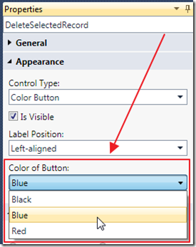
Now, a dropdown will be displayed to allow the LightSwitch application designer to select a color.
Yes You Can Now Sell Your Control
Now you have a LightSwitch control that you can easily sell.
Take a look at “My Offer To You” in this article: The Visual Studio LightSwitch Economy.
Special Thanks
A Special thanks to John Stallo and Stephen Weatherford of Microsoft. Without their assistance this Blog post would not have been possible.
Download Code
The LightSwitch project is available at http://lightswitchhelpwebsite.com/Downloads.aspx
Also See:
16 comment(s) so far...
You have brilliant timing Michael! I was just about to post a question in the LS forum asking how to add a combo box to the property sheet, and spotted your post advertising this blog entry.
haven't tried this yet, but your instructions seem clear enough, so will giveit a go. Thanks again for all your posts.
By Yossu on
9/26/2011 6:17 AM
|
OK, back again. Just tried this, and it works a treat. One question though...
You created an editor, and most of the code there is vanilla stuff, nothing to do with picking colours. It's only in the OnExplorerControlDataContextPropertyChanged() method where you add the items to the combo box that it's specific to a colour picker. So, is there a way to move those lines out of this class, and make the editor reusable for other properties as well? The way it is at the moment, it looks like we would have to duplicate pretty much the whole thing to do a different editor.
Thanks again
By Yossu on
9/26/2011 7:06 AM
|
@ossu - Yes you should be able to refactor things. My example of course was trying to keep things as simple as possible for easy understanding :)
By Michael Washington on
9/26/2011 7:23 AM
|
Thanks for the reply. Can you give me an idea how you would move this code out of the EntityPropertyPicker's code behind? I can see how you could call code in another class from here, but I'm not sure how you'd add the combo items from outside. bear in mind, if you ant the EntityPropertyPicker to be generic, then it has to allow an external class (say the ColorButton) to send in the desired colours. I'm not sure how you'd do that.
Also, I made a small improvement to your code. your GetColor() method has to be changed every time you want to use different colours in the editor. I changed this method so that it will handle any colour, meaning that you never need to change it. Here's the new (and rather shorter) code...
public static Color GetColor(string ColorName) {
Line lne = (Line)XamlReader.Load("");
return (Color)lne.Fill.GetValue(SolidColorBrush.ColorProperty);
}
I also moved this into a static helper class, so it could be used in other controls that want to set colours.
Thanks again for a great article. I woudl be grateful if you could explain how to set the colours from outside the EntityPropertyPicker.
By Yossu on
9/26/2011 7:47 AM
|
Sorry, just realised that your comment stuff removed the XML from that method. Here it is again HTML encoded!
public static Color GetColourFromName(string ColorName) {
Line lne = (Line)XamlReader.Load("");
return (Color)lne.Fill.GetValue(SolidColorBrush.ColorProperty);
}
By Yossu on
9/26/2011 7:49 AM
|
Grr! it did it again, even after I encoded it. OK, let's try again. I'll replace the angle brackets with square ones...
public static Color GetColourFromName(string ColorName) {
Line lne = (Line)XamlReader.Load("[Line xmlns=\"http://schemas.microsoft.com/winfx/2006/xaml/presentation\" xmlns:x=\"http://schemas.microsoft.com/winfx/2006/xaml\" Fill=\"" + ColorName + "\" /]");
return (Color)lne.Fill.GetValue(SolidColorBrush.ColorProperty);
}
By Yossu on
9/26/2011 7:50 AM
|
@Yossu - Unfortunately I spent 3 weeks on this article and I have to move on. I am so slammed with projects.
By Michael Washington on
9/26/2011 8:29 AM
|
OK, no problem! I appreciate the time you put into it. In the meantime, if you think of any pointers you can give, that would be great.
Thanks again for a great article!
By Yossu on
9/26/2011 8:30 AM
|
@Yossu - You should be able to place code in the "Common" project for reuse. Again, thank you for the feedback, it is appreciated.
By Michael Washington on
9/26/2011 8:34 AM
|
Michael,
JUST replacing "Button" to "HyperlinkButton" in XAML, gets "Color Link" button. Hey.. now I can sell two controls. :) :)
Now, I'm trying to add a Image on the button. It should be possible right?
By PowerBala on
10/7/2011 6:12 PM
|
@PowerBala - Yes you can definitely make a button that has an image on it
By Michael Washington on
10/7/2011 6:18 PM
|
One thing I didn't like in LightSwitch's button is, its auto alignment to 'Right' of its parent. Is there anyway to override that behavior in the code Michael?
By Bala on
10/8/2011 8:20 AM
|
@Bala - I am not sure, probably yes :)
By Michael Washington on
10/8/2011 8:36 AM
|
Michael, forgot to ask u this earlier. I get "drop down" for colors on design time. But its not showing up at runtime (Design Screen). It still shows as Textbox. Do I need to add the code to another project in order to see it?
By Bala on
10/11/2011 4:51 PM
|
@Bala - Yes I would need to implement the Silverlight editor for that. It was out of the scope of this simple example.
By Michael Washington on
10/11/2011 5:33 PM
|
Thanks Michael,
I was looking a long time to get this to work.
By Ralf de Kleine on
5/17/2012 7:20 AM
|