Feb
5
Written by:
Michael Washington
2/5/2012 1:35 PM

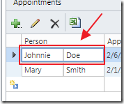
The LightSwitch Detail control extension is one of the most versatile of all the LightSwitch control extensions. When you are trying to create a reusable LightSwitch component, and other extension types are not working for you, you may find the Detail control extension will fit your needs.
There are 5 kinds of LightSwitch control extensions that you can create:
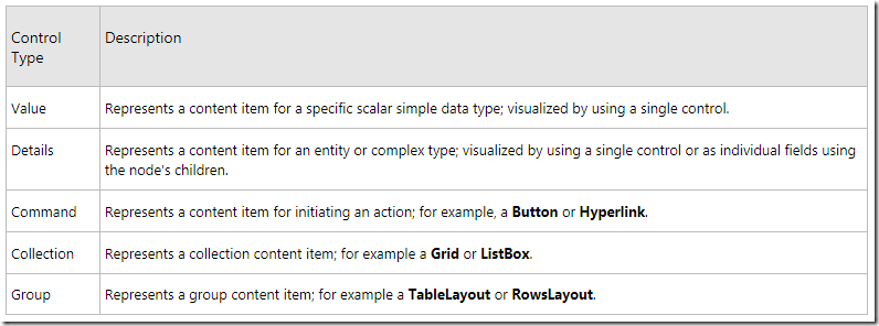
(Image from How To: Create a A LightSwitch Control © Microsoft)
The Value control extension (covered in: How To Create a Simple Control Extension (Or How To Make LightSwitch Controls You Can Sell)) and the Detail control extension are very similar, the main difference is that the Detail control extension is bound to an entire entity whereas a Value control extension is only bound to a single field in an entity.
The Microsoft Detail Control Extension Tutorial
Microsoft created one of their most thorough and complete LightSwitch API documents with the article: Walkthrough: Creating a Detail Control Extension. In this article we will start with the project created in that article and simply alter it to add a second configurable property. This will demonstrate how the control binds and displays data in LightSwitch.
Using The Detail Control Extension (Before Altering It)

You can download the completed code for the article: Walkthrough: Creating a Detail Control Extension from: http://code.msdn.microsoft.com/silverlight/LightSwitch-Detail-Control-a77ab62a/.
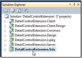
When we open the project, we see that there are 7 projects.
We click on the .vsix project and run it.
This will open another instance of Visual Studio.
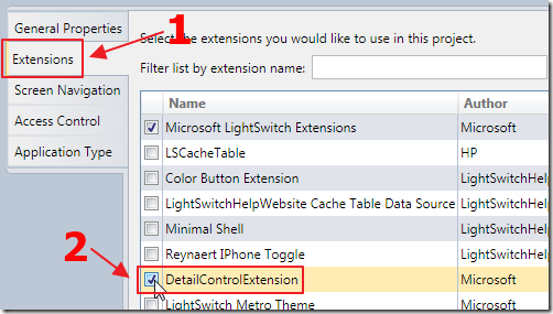
We create or open a LightSwitch project and go into Properties.
We click on the Extensions tab and enable the DetailControlExtension.
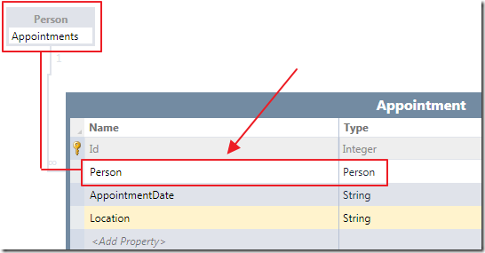
When we have an Entity, that has a related collection…
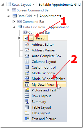
…that collection can be represented by a LightSwitch control or extension that can be bound to a Entity, such as the Summery control (or the Detail control that we are currently debugging).
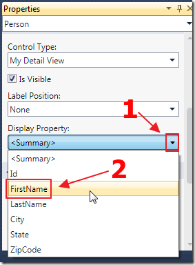
The properties for the Detail control allow us to select one field (from the Entity that it is bound to) to display.
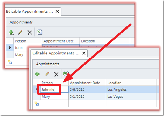
When we run the application, the field will be editable.
However, the control will only display one field.
We will now enhance the extension to display two fields.
Enhancing The Control Extension
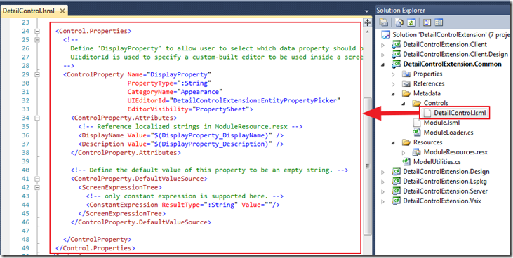
We stop the project and return to the extension project.
We open the DetailControl.lsml file that defines the properties of the control.
We add the following control property (notice that we are able to simply reuse the EntityPropertyPicker (the dropdown that displays the available fields of the bound Entity) for the UIEditor for the property):
    <ControlProperty Name="DisplayProperty2"
        PropertyType=":String"
        CategoryName="Appearance"
        UIEditorId="DetailControlExtension:EntityPropertyPicker"
        EditorVisibility="PropertySheet">
        <ControlProperty.Attributes>
            <DisplayName Value="Second Property Display" />
            <Description Value="A second property to display" />
        </ControlProperty.Attributes>
        <!-- Define the default value of this property to be an empty string. -->
        <ControlProperty.DefaultValueSource>
            <ScreenExpressionTree>
                <!-- only constant expression is supported here. -->
                <ConstantExpression ResultType=":String" Value=""/>
            </ScreenExpressionTree>
        </ControlProperty.DefaultValueSource>
This is all that is required to make a second dropdown display in the property panel of the control.
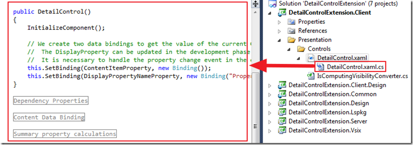
Next, we open the DetailControl.xaml.cs file that provides the supporting code for the control’s user interface.
The first thing we do is add some additional dependency properties.
The first dependency property we add is to store the selected Property (field) in the Entity:
        public IProperty EntityProperty2
        {
            get { return (IProperty)GetValue(EntityPropertyProperty2); }
            set { SetValue(EntityPropertyProperty2, value); }
        }
        public static readonly DependencyProperty EntityPropertyProperty2 =
            DependencyProperty.Register("EntityProperty2", typeof(IProperty),
            typeof(DetailControl), new PropertyMetadata(null));
We also add a dependency property to store the name of the selected property (this will come from the additional dropdown we added in the property page of the control):
        public string DisplayPropertyName2
        {
            get { return (string)GetValue(DisplayPropertyNameProperty2); }
            set { SetValue(DisplayPropertyNameProperty2, value); }
        }
        public static readonly DependencyProperty DisplayPropertyNameProperty2 =
            DependencyProperty.Register("DisplayPropertyName2", typeof(string),
            typeof(DetailControl), new PropertyMetadata(OnDisplayPropertyNameChanged2));
        private static void OnDisplayPropertyNameChanged2(DependencyObject d, DependencyPropertyChangedEventArgs e)
        {
            // When the DisplayPropertyName2 is changed, we reset the internal data binding
            ((DetailControl)d).SetContentDataBinding();
        }
In the constructor for the control, we add the following line that will bind the value selected in the dropdown of the property page, to the dependency property:
            this.SetBinding(DisplayPropertyNameProperty2,
                new Binding("Properties[DetailControlExtension:DetailControl/DisplayProperty2]"));
We also add the following code to set the EntityProperty based on the selected DisplayPropertyName2:
        string displayPropertyName2 = this.DisplayPropertyName2;
        IEntityPropertyDefinition entityProperty2;
        if (String.IsNullOrEmpty(displayPropertyName2))
        {
            // When the DisplayProperty2 is not set, we need to get the summary property
            entityProperty2 = GetSummaryProperty(entityType);
        }
        else
        {
            // otherwise, we get the entity property
            entityProperty2 = entityType.Properties
                .FirstOrDefault(p => String.Equals(p.Name, displayPropertyName2,
                    StringComparison.OrdinalIgnoreCase));
        }
        if (entityProperty2 != null)
        {
            // Set data binding to the entity property.
            this.SetBinding(EntityPropertyProperty2,
                new Binding(String.Format(System.Globalization.CultureInfo.InvariantCulture,
                    "Value.Details.Properties.{0}", entityProperty2.Name)));
        }
(note to make the code easier to understand, I have omitted code required to implement the IsComputedProperty. You can read about that code in the original Microsoft article).
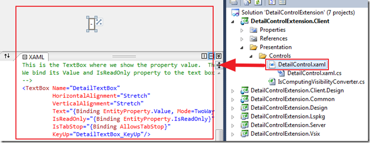
Next, we open the DetailControl.xaml file, that contains the user interface for the control.
We add another TextBox to the user interface:
    <TextBox Name="DetailTextBox2"
            HorizontalAlignment="Stretch"
            VerticalAlignment="Stretch"
            Text="{Binding EntityProperty2.Value, Mode=TwoWay}"
            IsReadOnly="{Binding EntityProperty2.IsReadOnly}"
            IsTabStop="{Binding AllowsTabStop}"
            KeyUp="DetailTextBox_KeyUp" Width="60" />
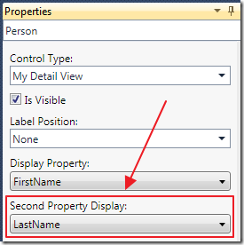
When we run the project we can choose a field from the Entity to display as the second field.

When we run the project, the control now has two editable fields.
Download Code
The LightSwitch project is available at http://lightswitchhelpwebsite.com/Downloads.aspx
Also See:
Walkthrough: Creating a Detail Control Extension
Microsoft Tutorials:
Walkthrough: Creating a Value Control Extension
Walkthrough: Creating a Smart Layout Control Extension
Walkthrough: Creating a Stack Panel Control Extension
How to: Create a LightSwitch Extension Project
How to: Debug or Test a LightSwitch Extension
How to: Set VSIX Package Properties
How to: Distribute a LightSwitch Extension