Feb
8
Written by:
Michael Washington
2/8/2012 10:44 PM

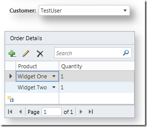
Visual Studio LightSwitch allows you to create Group extensions. A Group extension allows you to specify the layout of controls contained in the group.

Microsoft has an article, Walkthrough: Creating a Stack Panel Control Extension, that covers the basics of creating a Stack Panel extension for LightSwitch. That article creates an extension that preforms the same functionality as the Rows Layout control that comes in LightSwitch. This article will cover creating an extension that groups controls in a border with a shadow.
First note that the following are required in order to create LightSwitch extensions:
Create The Project
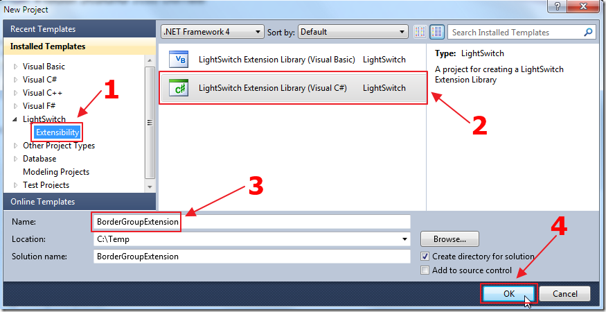
First, we create an extension project in Visual Studio.
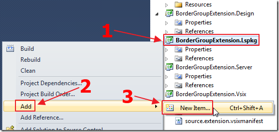
We add a New Item to the .Lspkg project.
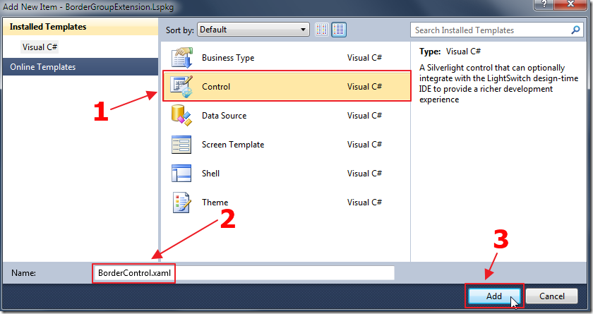
We add a Control to the project.
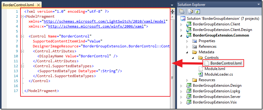
A number of files are created in the various projects in the solution, including a BorderControl.lsml file in the Metadata/Controls folder in the .Common project.
Change the code in the BorderControl.lsml file to the following code:
<?xml version="1.0" encoding="utf-8" ?>
<ModelFragment
  xmlns="http://schemas.microsoft.com/LightSwitch/2010/xaml/model"
  xmlns:x="http://schemas.microsoft.com/winfx/2006/xaml">
    <!-- Define a Group control  -->
    <Control Name="BorderControl"
      SupportedContentItemKind="Group"
      AttachedLabelSupport="DisplayedByControl"
      DesignerImageResource="BorderGroupExtension.BorderControl::ControlImage">

        <Control.Attributes>
            <DisplayName Value="BorderControl" />
        </Control.Attributes>
        <!-- Define New Control Properties -->
        <Control.Properties>
            <!--Define a Margin property for all  -->
            <!--immediate children of the control. -->
            <!--It must be an attachable property,  -->
            <!--just like a Grid in SilverLight adding -->
            <!--Grid.Row property to its children. -->
            <ControlProperty Name="Margin"
                             PropertyType=":Double"
                             IsAttachable="True"
                             AttachedPropertyAvailability="ImmediateChildren"
                             EditorVisibility="PropertySheet">

                <ControlProperty.Attributes>
                    <DisplayName Value="Margin" />
                    <Description Value="The space between controls." />
                </ControlProperty.Attributes>
                <!-- Define the default value of Margin to 0 -->
                <ControlProperty.DefaultValueSource>
                    <ScreenExpressionTree>
                        <ConstantExpression ResultType=":Double" Value="0"/>
                    </ScreenExpressionTree>
                </ControlProperty.DefaultValueSource>
            </ControlProperty>
        </Control.Properties>
        <!-- Override AttachedLabelPosition so  -->
        <!-- it can be shown on the property sheet -->
        <Control.PropertyOverrides>
            <ControlPropertyOverride
                Property=":RootControl/Properties[AttachedLabelPosition]"
                EditorVisibility="PropertySheet">
            </ControlPropertyOverride>
        </Control.PropertyOverrides>
    </Control>
</ModelFragment>
Create The Control
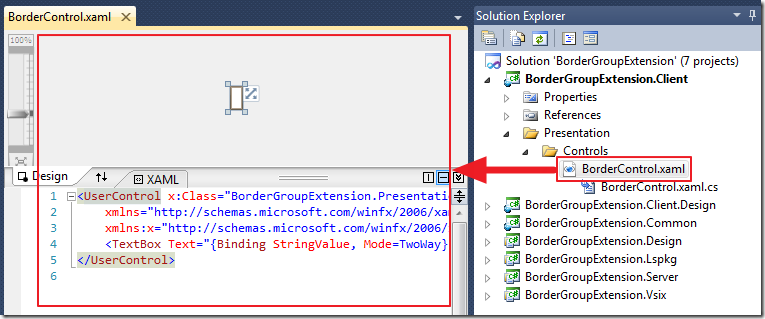
Open the BorderControl.xaml file in the Presentation/Controls folder in the .Client project and change the content to the following:
<UserControl x:Class="BorderGroupExtension.Presentation.Controls.BorderControl"
    xmlns="http://schemas.microsoft.com/winfx/2006/xaml/presentation"
    xmlns:x="http://schemas.microsoft.com/winfx/2006/xaml"
    xmlns:framework ="clr-namespace:Microsoft.LightSwitch.Presentation.Framework;assembly=Microsoft.LightSwitch.Client"
    xmlns:controls="clr-namespace:BorderGroupExtension.Presentation.Controls;assembly=BorderGroupExtension.Client"
 >
    <UserControl.Resources>
        <!-- Define a converter to convert a LightSwitch control property  -->
        <!-- to value used in SilverLight controls. -->
        <controls:DoubleToThicknessConverter x:Key="DoubleToThicknessConverter" />
    </UserControl.Resources>
    <!-- An ItemsControl is used here to create ContentItemPresenter  -->
    <!-- for all child item in the LightSwitch content tree. -->
    <ItemsControl ItemsSource="{Binding ChildItems}" >
        <!-- ItemsPanel allows us to choose to use a stack panel to arrange all child items. -->
        <!-- Different group control typically uses a different layout panel here. -->
        <ItemsControl.ItemsPanel>
            <ItemsPanelTemplate>
                <StackPanel Orientation="Vertical">
                </StackPanel>
            </ItemsPanelTemplate>
        </ItemsControl.ItemsPanel>
        <ItemsControl.ItemTemplate>
            <DataTemplate>
                <!-- The border surrounds the ContentItemPresenter -->
                <Border Padding="10" CornerRadius="10">
                    <framework:ContentItemPresenter
                        ContentItem="{Binding}"
                        Margin="{Binding Path=Properties[BorderGroupExtension:BorderControl/Margin],
                        Converter={StaticResource DoubleToThicknessConverter}}" />
                    <!-- The border shadow -->
                    <Border.Effect>
                        <DropShadowEffect BlurRadius="30" Color="Gray"
                                          Direction="-45" Opacity="0.5" ShadowDepth="10">
                        </DropShadowEffect>
                    </Border.Effect>
                </Border>
            </DataTemplate>
        </ItemsControl.ItemTemplate>
    </ItemsControl>
</UserControl>
Also we add a class file to the project called: DoubleToThicknessConverter.cs and use the following code:
using System;
using System.Windows;
using System.Windows.Data;
namespace BorderGroupExtension.Presentation.Controls
{
    /// <summary>
    /// A value converter to convert double value defined in the control property
    ///  to a Thickness value used in the SilverLight control.
    /// </summary>
    public class DoubleToThicknessConverter
        : IValueConverter
    {
        public object Convert(object value, Type targetType, object parameter,
            System.Globalization.CultureInfo culture)
        {
            return new Thickness((double)value);
        }
        public object ConvertBack(object value, Type targetType, object parameter,
            System.Globalization.CultureInfo culture)
        {
            throw new NotSupportedException();
        }
    }
}
Run The Project

We click on the .Vsix project…

We then Start Debugging. This will open another instance of Visual Studio.
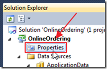
We create or open a LightSwitch project and go into Properties.
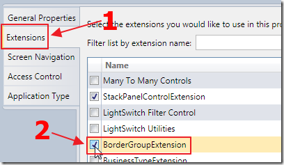
We click on the Extensions tab and enable the extension.
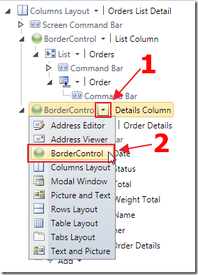
When laying out a Screen we now have the option to select the BorderControl control.
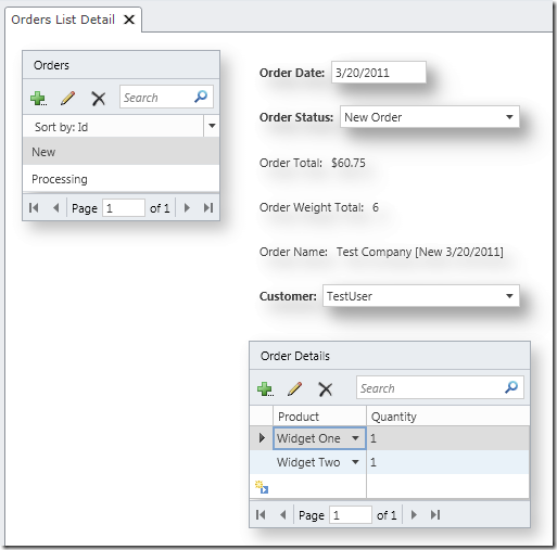
When we run the application, we see the effects of the control.
Download Code
The LightSwitch project is available at http://lightswitchhelpwebsite.com/Downloads.aspx
Also See:
Microsoft Tutorials:
6 comment(s) so far...
Very nice Michael! You continue to impress me with your efforts. Pretty soon I will have to create a LS application to track all of your tutorials and tips.
Thanks!
By Bill Mason on
2/9/2012 3:31 AM
|
@Bill Mason - Thanks for the support and the friendly words. I appreciate it :)
By Michael Washington on
2/9/2012 5:15 AM
|
I have tried the Walkthrough: Creating a Stack Panel Control Extension expecting (as you stated) the Group Extension to behave like the Rows Layout does. I find that it does not in one important aspect. The stack panel allows it's child controls to stretch as large as they need, where as the Rows Layout sizes its child controls who have the vertical alignment set to stretch so that all contents fits on the screen.
Am I missing something? I've run through this too many times to count.
By Jeremy Friesen on
1/4/2013 1:56 PM
|
@Jeremy Friesen - I do not know, sorry.
By Michael Washington on
1/4/2013 5:11 PM
|
Would put an "IsBusy" property in this control, set the value to "True" using the Busy Indicator of the Silverlight ToolKit?
By Victor on
10/6/2013 7:09 AM
|
@Victor - It may, but it has been over two years since I have done any Silverlight coding that I am afraid I am way out of practice. Please make a post to he official LightSwitch forums at: http://social.msdn.microsoft.com/Forums/vstudio/en-US/home?forum=lightswitch
By Michael Washington on
10/6/2013 7:11 AM
|